The old version is still available here
Customize the look and feel of Mux Player
Learn how to customize the look and feel of Mux Player to fit your brand and use case.
In this guide:
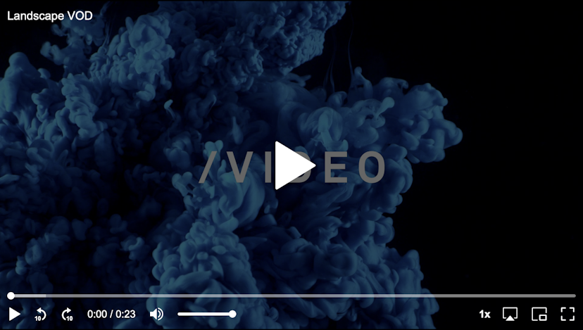
Customize the poster image
Customize the poster image
Pull a specific poster image from Mux, or use your own
Add a video title
Add a video title
Add a title to the top left of Mux Player
Style with CSS
Style with CSS
Style Mux Player with CSS
Provide color variables
Provide color variables
Provide primary and secondary color variables to customize the look of Mux Player
Change default behavior
Change default behavior
Mux Player provides specific APIs for overriding the default behavior
Keyboard shortcuts
Keyboard shortcuts
control keyboard shortcut behavior
Customize the poster image
By default Mux Player will pull the default poster image from the middle of the video based on the Playback ID that you provide. The default poster image is the mid-point of the Mux asset.
https://image.mux.com/{PLAYBACK_ID}/thumbnail.jpg
If you want to change the poster image, you have two options:
-
Pass in
thumbnail-time(React:thumbnailTime) with the value in seconds of the thumbnail that you want to pull from the video.- The
thumbnail-timeattribute and corresponding React prop are only available if you're NOT using Signed URLs. - If you are using Signed URLs you'll need to add the
time=parameter to your signed token (see the Usage with signed URLs guide).
- The
-
Use the
poster=attribute (both HTML element and React).- You can set any arbitrary image URL the same way you would do with the HTML5
<video>element. For the best viewer experience, your poster image should match the aspect ratio of the video.
- You can set any arbitrary image URL the same way you would do with the HTML5
Provide a placeholder while the poster image loads
While the poster image loads, Mux Player will display the contents of the placeholder= attribute. Consider using a Data URL so that the placeholder is immediately available without a network request.
If you are generating your pages with a Node.js server (like Next.js), you can generate Data URLs for Mux Videos with the @mux/blurhash package.
The Data URLs generated by @mux/blurhash contain lightweight multicolor gradients that visually represent what the default poster image will look like once it has fully loaded.
For example:
// Server-Side
import muxBlurHash from "@mux/blurhash";

const getBlurHash() = async () => {
  const playbackId = "3fevCt00ntwf7WxwvBhRo1EZ01IoABwo2d";
  const { blurHashBase64, sourceWidth, sourceHeight } = await muxBlurHash(playbackId);
};
<!-- Client-Side -->
<mux-player
stream-type="on-demand"
playback-id="{playbackId}"
placeholder="{blurHashBase64}"
style="aspect-ratio: {sourceWidth} / {sourceHeight}"
></mux-player>If you change the thumbnail time with thumbnailTime, you should also pass a time configuration to muxBlurHash(playbackId, { time: customThumbTime }) to generate the correct placeholder.
You can learn more about @mux/blurhash on GitHub.
If you have a client-side-only application and you can't generate a blurhash, you might want to pass a smaller resolution poster image URL as the placeholder value that will load more quickly than the final hi-res poster.
Add a video title
Use the title attribute (title prop in React) to add a visible title in the top left corner on Mux Player. Note that this is different that metadata-video-title, which is a Mux Data metadata field.
Style with CSS
Mux Player HTML element can be styled and positioned with CSS just like you would any other HTML element. For example:
mux-player {
  width: 100%;
  max-width: 800px;
  margin: 40px auto;
}
In React, you can style the <MuxPlayer> component the same way you style other components; with styled-components or directly with the style= prop.
Aspect ratio
The Mux API will provide you the aspect ratio of your video in the form of w:h. You should save this aspect_ratio in your database or CMS alongside the playback_id and other asset details. Then you can use that with CSS in the form of w / h. This is using the CSS aspect-ratio property which is supported in all evergreen browsers.
Setting the aspect ratio of the player is important for preventing Cumulative Layout Shift on the page.
mux-player {
  aspect-ratio: 16 / 9;
}
Video size and position
You can change the way that video is sized within its <video> element. Mux Player provides two css variables that you can use to override the standard object-fit and object-position css properties.
mux-player {
  --media-object-fit: cover;
  --media-object-position: center;
}
Hiding controls with CSS
By default, Mux Player will show all the controls associated with the current player size and stream type.
To hide certain controls, use CSS variables like this:
--seek-backward-button will control the display of the seek backward button. Set it to none to hide it completely.
mux-player {
  --seek-backward-button: none;
  --seek-forward-button: none;
}
CSS vars can also be passed inline
<mux-player
  style="--seek-backward-button: none; --seek-forward-button: none;"
></mux-player>
Controls sections
You can target specific sections of the player by prefixing the CSS vars with the section. The following sections are available:
topthe top control bar that shows on the small player sizecenterthe center controls that show the seek forward/backward button and play buttonbottomthe bottom control bar
<mux-player
  style="--center-controls: none; --top-captions-button: none;"
></mux-player>
Available CSS variables
The below CSS selector shows all available CSS vars for hiding, each one can be prefixed with a section.
mux-player {
  /* Hide all controls at once */
  --controls: none;

  /* Target all sections by excluding the section prefix */
  --play-button: none;
  --seek-live-button: none;
  --seek-backward-button: none;
  --seek-forward-button: none;
  --mute-button: none;
  --captions-button: none;
  --airplay-button: none;
  --pip-button: none;
  --fullscreen-button: none;
  --cast-button: none;
  --playback-rate-button: none;
  --volume-range: none;
  --time-range: none;
  --time-display: none;
  --duration-display: none;

  /* Target a specific section by prefixing the CSS var with (top|center|bottom) */
  --center-controls: none;
  --bottom-play-button: none;
}
Controls Backdrop Color
Mux Player exposes a CSS variable (--controls-backdrop-color) to set the controls backdrop color.
This is the background color that will show up behind the controls in the player.
mux-player {
  --controls-backdrop-color: rgb(0 0 0 / 60%);
}
The backdrop color is turned off by default. Note if you change this color be sure to make the contrast against the controls high enough as it has implications on the accessibility of the controls as they may not meet the contrast ratio requirements for WCAG 2.1.
CSS Parts
Mux Player uses a shadow DOM to encapsulate its styles and behaviors. As a result, it's not possible to target its internals with the usual CSS selectors. Instead, some components expose parts that can be targeted with the CSS part selector, or ::part().
<style>
  mux-player::part(center play button) {
    display: none;
  }
</style>
<mux-player playback-id="DS00Spx1CV902MCtPj5WknGlR102V5HFkDe"></mux-player>
Supported parts: seek-live, layer, media-layer, poster-layer, vertical-layer, centered-layer, gesture-layer, top, center, bottom, play, button, seek-backward, seek-forward, mute, captions, airplay, pip, cast, fullscreen, playback-rate, volume, range, time, display.
CSS parts allow you to style each part individually with a selector like ::part(center play button) or target multiple elements if the part is assigned to multiple elements internally, usage ::part(button). Every CSS property can be declared in the selector, this makes it a very powerful API.
Note that if you are using advanced styling with ::parts selectors then be sure to test out your custom styles when upgrading to new versions of Mux Player.
Provide color variables
The colors of Mux Player can be customized with the following options:
primary-color(HTML element) /primaryColor(React): This will change the color of the control iconssecondary-color(HTML element) /secondaryColor(React): This will set the background color of the control bar
HTML element Example:
React example:
import MuxPlayer from "@mux/mux-player-react";

export default function App() {
  return (
    <MuxPlayer
      streamType="on-demand"
      playbackId="EcHgOK9coz5K4rjSwOkoE7Y7O01201YMIC200RI6lNxnhs"
      metadata={{
        video_id: "video-id-54321",
        video_title: "Test video title",
        viewer_user_id: "user-id-007",
      }}
      primaryColor="#f97316"
      secondaryColor="#7c2d12"
    />
  );
}
Change default behavior
Below are the attributes (Web Component) / props (React) available to enable, disable, hide, or change aspects of various controls to suit your use case.
Mute
While Mux Player defaults to enabling sound, you can pass an attribute/prop to start playback muted.
muted (HTML element & React) is a boolean value that, when true, defaults sound to a muted state. Users can still unmute and manage volume as desired.
Skip forward/backward
The amount of time for skip forward/backward defaults to 10 seconds. This can be changed by passing the following attributes (HTML element) / props (React).
forward-seek-offset(HTML element) orforwardSeekOffset(React)- example:
forward-seek-offset="5"will apply a 5 second skip forward
- example:
backward-seek-offset(HTML element) orbackwardSeekOffset(React)- example:
backward-seek-offset="5"will apply a 5 second skip backward
- example:
Closed captions
When captions are available on an asset, we show the control for them and enable their appearance by default.
You can opt to disable their appearance (while still showing the control) by using the default-hidden-captions (HTML element) attribute or defaultHiddenCaptions (React) prop and a boolean value.
Start time
If you'd like to set a specific time stamp as the start of playback for an asset, you can use the start-time (HTML element) attribute or startTime (React) prop and a time value.
When start-time is provided, it will also be used for the thumbnail-time if no thumbnail-time is explicitly provided.
Example: start-time="13" will begin playback at 13 seconds into the asset.
Autoplay
Autoplay in browsers is a difficult beast. See this doc if you're curious about the details. The good news is that Mux Player can help you handle autoplay when it is warranted.
Before you decide to autoplay your assets, first ask yourself: Is this necessary? Often times it negatively impacts accessibility, and many viewers find autoplay to be an impediment to their experience.
Here are your options for autoplay:
autoplayattribute (React:autoPlayprop): This will behave like the HTML video elementautoplayattribute. It will try to autoplay with the sound on, and likely it will fail.autoplay="muted"attribute (React:autoPlay="muted"): This will autoplay the video in the muted state (and likely work).autoplay="any"attribute (React:autoPlay="any"): This will autoplay the video with sound first, and if that fails then it will try to autoplay muted.
Looping content
You can automatically loop the asset once playback completes with the loop HTML element attribute or React prop and a boolean value.
If you have a background looping video on your page for example, you might want to: turn off all controls, autoplay, mute and loop the video:
<style>
  mux-player {
    --controls: none;
  }
</style>

<mux-player
  playback-id="23s11nz72DsoN657h4314PjKKjsF2JG33eBQQt6B95I"
  autoplay="muted"
  loop
></mux-player>
Keyboard shortcuts
By default, Mux Player has several keyboard shortcuts, or hotkeys, enabled. These hotkeys will only function if the player or one of the player controls are focused.
Default hotkeys
| Key | Name to turn off | Behavior |
|---|---|---|
| Space | nospace | Toggle Playback |
c | noc | Toggle captions/subtitles track |
k | nok | Toggle Playback |
m | nom | Toggle mute |
f | nof | Toggle fullscreen |
| ⬅️ | noarrowleft | Seek back 10s |
| ➡️ | noarrowright | Seek forward 10s |
Turning hotkeys off
You can turn off all hotkeys or individual ones.
Turning all hotkeys off
To turn all hotkeys off, add the nohotkeys attribute to the Mux Player element:
<mux-player
  nohotkeys
  stream-type="on-demand"
  playback-id="EcHgOK9coz5K4rjSwOkoE7Y7O01201YMIC200RI6lNxnhs"
  metadata-video-title="Test video title"
  metadata-viewer-user-id="user-id-007"
></mux-player>
You can also do it via JavaScript:
const player = document.querySelector("mux-player");
// disable all hotkeys
player.nohotkeys = true;

// re-enable all hotkeys
player.nohotkeys = false;
Turning off specific hotkeys
If you only want to turn off specific hotkeys, you can do so via JavaScript or HTML.
Using the "Name to turn off" above, you can add those to a hotkey attribute to turn off the specific hotkeys you don't want enabled.
For example, to turn off seeking with the arrow keys:
<mux-player
  hotkeys="noarrowleft noarrowright"
  stream-type="on-demand"
  playback-id="EcHgOK9coz5K4rjSwOkoE7Y7O01201YMIC200RI6lNxnhs"
  metadata-video-title="Test video title"
  metadata-viewer-user-id="user-id-007"
></mux-player>
You can also do this programmatically via the hotkeys property on the element. This provides a DOM Token List, a la classList, that allows you to add or remove each key.
const player = document.querySelector("mux-player");

// turn off seeking with the arrow keys
player.hotkeys.add("noarrowright", "noarrowleft");

// re-enable the arrow keys
player.hotkeys.remove("noarrowright", "noarrowleft");